Contents

Are you looking to grow your email list, promote offers, or encourage people to take a specific action on your website? Then we may have a new idea for you to try – opt-in pop-up forms.
While pop-up notifications do have the unfortunate reputation of annoying site visitors, don’t let this discourage you from using them as part of your lead generation strategy. Instead, we actually advise you to give them a try!
In this article, we’ll equip you with everything you need to know about lead generation pop-up forms. This includes what they are, best practices, and we’ll even share a few inspirational examples that may help you create your own. Let’s dive in!
What Is a Lead Generation Pop-Up Form?
Marketers use lead-generating pop-up forms on their websites to help gain email addresses and other essential information from site visitors. The acquired information helps convert and nurture site visitors into clients.
Hints their name, pop-ups are designed to “pop up” on any part of the web page during a customer’s journey and encourage them to complete an action. This lead generation strategy is very effective, as its conversion rate can ramp up to 9% when done right.
Lead Generation Pop-Up Form Best Practices
Below are some essential tips to consider when designing pop-ups that yield the best results.
Add a Clear Call-to-Action
In your pop-up, it’s good to clearly state the action you want site visitors to take. This can be anything from signing up for your email list, accessing special offers, sharing on social media, and more.
For this reason, it’s also important to include a strong call-to-action (CTA) button to help direct visitors to more relevant pages.
Make Your CTA Stand Out
Besides writing compelling pop-up text, be sure to use an attention-grabbing color that sets it apart from the rest of the opp-up writings. By drawing the guests’ attention, you increase the chances of their clicking and taking action on your site.
Design Your Pop-ups to Match Your Site
You’ll want to create a pop-up that appears to be part of your website and not an intruder. That way, site guests will consider it part of your web page and not some irritating message.
Try Different Pop-up Formats
While the commonly used pop-ups are those that cover the screen until you respond, you could go for less obtrusive versions like slide-ins and notification bars.
Testing different types of pop-ups will give you a better idea of how your visitors will react and respond.
Consider Mobile Devices
Currently, more than 50% of website traffic globally comes from mobile accounts. Therefore, it’s important to factor this in when designing your lead generation pop-ups.
So in this case, you may want to consider using a less intrusive pop-up instead of a full modal one.
Practice Proper Timing
Even though the time factor isn’t to be considered when designing a pop-up, it’s an essential part of your pop-up’s success. For that reason, you could try inserting various delay tactics instead of displaying your pop-up at once.
The available options generally include after scrolling to some point on a page, when the visitor is about to exit, after scrolling for some time, or after a specific number of views.
Offer Incentives
When including special discounts in your pop-ups, can give site visitors an extra push to take the intended action by offering something in return, such as a discount for example. Thus, you increase the engagement of your audience with your pop-ups.
7 Great Lead Generation Pop-up Form Examples That Work
As promised, here are some pop-up form designs from various brands that can give you a clear idea of what you need to have for excellent results of your pop-up campaigns.
1. Simple Pop-up with Straightforward Message
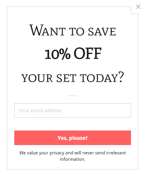
The pop-up above is a very straightforward but effective design. It also has an incentive off any expense that the prospect may incur. The approach can increase your email list by far!
2. Promotional Pop-Up for New Visitors
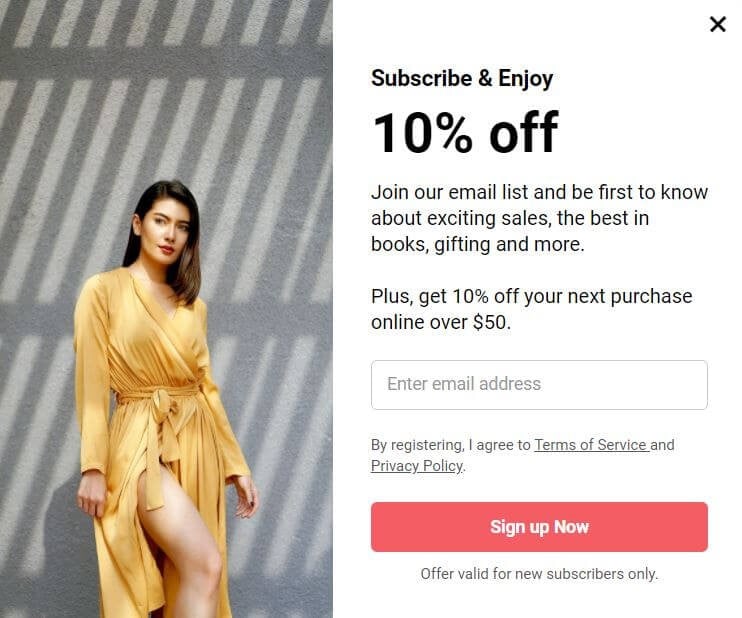
The use of incentives in this pop-up is very compelling. It’s clear to the site visitors that they win 10% off on their next purchase upon a successful subscription. After all, customers will go for brands that help them save some cash!
The pop-up also has persuasive language “Subscribe & Enjoy.” It inspires the audience to join their email list and enjoy fantastic offers. The subscription process is simplified as the guests only need to enter their email addresses, click the sign-up button, and are good to go!
3. Online Store Pop-up with Exclusive Offers
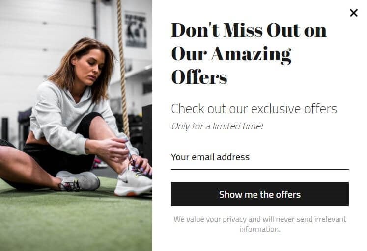
This traditional square pop-up window takes up after the brand’s website appearance. It welcomes site visitors with exclusive offers and creates a sense of agency. This compels the visitors to take immediate action, as the offers won’t last long.
4. Lifestyle & Home Magazine Pop-up with Free Recipes Resource
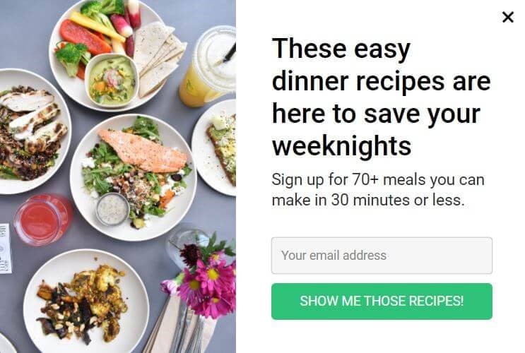
This brand’s pop-up displays a “chicken dinner ideas” page, making it highly relevant to site visitors. When your pop-up connects with the reader’s needs, it becomes very effective.
Its value proposition is straightforward as it outlines the benefits the audience is searching for. While the reader may be looking for a walk-over recipe after a hard day’s work, the pop-up promises just that! And, the eye-catching image shows the mouth-watering meal as the end result.
The design also has a clear and actionable CTA, and you can easily dismiss it using the X button.
5. Exit-Intent Pop-up
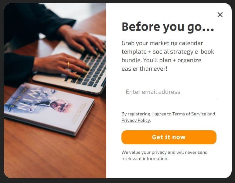
The brand tries its luck in reaching out to customers at the exit stage. The pop-up is set to detect and show up when the visitor is about to click the exit button of the particular page.
The pop-up is very effective in lead generation. Now that the visitor has gone through your page content, they can make an informed decision to join your list or any other action indicated in the CTA.
6. Exit-Intent Pop-up with Educational Resource
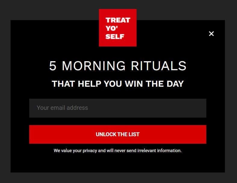
This pop-up is a twisted version of a full-screen welcome mat pop-up that shows when the reader expresses the intention to exit the page. It’s, therefore, less intrusive and not annoying to most guests.
The strategy is excellent in capturing the audience at their exit point, where they can make an informed decision as they have already read the content.
The contrasting color of the CTA makes it attractive to the readers, while the button text gives a personalized experience to site visitors. All this makes the pop-up irresistible!
7. Stuck In Customs Traveling Guide Pop-up in the Right Corner
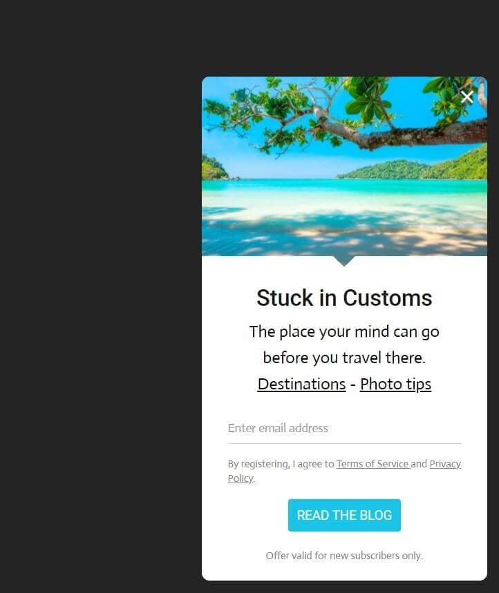
This entry pop-up directs site visitors to their destinations. It’s a navigational tool that guides the new and returning guests with ease by speeding up their exploration.
One essential tip we can draw from this example is that you can design an effective unique pop-up without necessarily including an incentive!
All these pop-up examples are created using the Sender.net form builder. Sender offers several different template options you can customize to fit your promotional needs.
Using Effective Pop-up Forms to Generate More Leads
Website pop-up forms are usually very annoying to most site guests due to their intrusive nature. Therefore, you must ensure that your pop-ups are tied up to something beneficial to your site visitors.
This increases the rate at which your audience engages with your pop-up box. For instance, you can provide a discount code for first-time purchasers, give special offers, offer exclusive content, and much more.
What are your thoughts on using pop-ups on your site? How have they helped you generate more leads? Share your comments with us below!
If you liked this article, be sure to follow us on Twitter, Instagram, Facebook, and LinkedIn! And don’t forget to subscribe to our newsletter.

does this work up to 9% on the leads generation if so then it can be really used to get the leads and I am definitely using it thanks to thirstyaffiliate.
Thanks for the valuable article you prepared
A big thumbs up for your informative article. Thanks for presenting this enlightening article!! you have really provided relevant information here , I am really very glad that I found your blog, keep sharing.
Thank you for sharing such an informative article. I have bookmarked your website for further posts.
I found your article very informative. Thanks for shairing such an informative article. I have bookmarked your website for further posts.