Contents

As an affiliate marketer, your ultimate goal is to sell more online. But creating product pages that captivate your audience can be a challenge. There are so many things to consider, from design and aesthetics to user experience (UX), all of which can make the process more complex than anticipated.
But don’t worry, there are strategies to help make your product pages stand out and attract attention.
In this article, we’ll explain why having professional product pages is critical to your affiliate site’s success. Then, we’ll share 5 expert tips for optimizing your product pages to increase engagement and sales. Let’s get started!
Why Engaging Product Pages Matter to Your Affiliate Site
Engaging product pages are an absolute must-have for any affiliate site. They’re like the virtual storefront of your website, where visitors get their first impression of your products and brand. If your product pages don’t grab their attention, visitors will quickly move on to another site that does.
Product pages also help build trust with your audience. By providing accurate and detailed information about your products, you show that you’re knowledgeable and passionate about what you’re promoting. This builds trust and credibility with your visitors, which can increase the chances of making a sale.
Engaging product pages can also help set your affiliate site apart from the competition. When visitors come across a well-designed and informative product page, they’re more likely to stick around and explore your site further. They may even tell their friends about your site, which can lead to more traffic and sales.
Another great benefit of engaging product pages is, they can increase your conversion rate. When visitors have access to all the information they need about a product, they’re more likely to make a purchase. By providing detailed descriptions, specs, and high-quality images, you can help them visualize themselves using the product and make an informed decision.
5 Ways You Can Create Engaging Product Pages for Your Affiliate Site
If you want to catch the eye of potential customers, you gotta optimize those product pages. Lucky for you, it’s not rocket science! Here are 5 killer strategies to make your pages stand out and get those clicks.
1. Use Informative and Clear Descriptions
Did you know that 20% of shoppers won’t buy a product if they feel like something is off about the description? You don’t want to miss out on potential customers just because your description is unclear or missing information.
On the flip side, a well-written product description can help customers make informed purchasing decisions. So make sure to clearly state what the product does and how it benefits the customer.
Feature vs Benefit
Here’s a copywriting tip: lead with the benefit so buyers have a clear understanding of the product’s value. Why? It’s simple – buyers want to know what’s in it for them!
If you clearly and concisely communicate the value and benefits of your product, you’re more likely to capture the buyer’s attention and ultimately make a sale.
Say you’re promoting a weight loss supplement. Instead of starting with a description of the ingredients or how the supplement works, lead with the benefit. For example, “Are you tired of feeling sluggish and self-conscious about your weight? Our weight loss supplement can help you shed those extra pounds and feel confident and energized!”
See the difference? By focusing on the benefit, “feeling confident and energized”, you’re tapping into the buyer’s emotions and desires. And that’s what ultimately drives a purchase decision.
What Else Should You Include?
You want to give your readers a crystal clear image of what they can expect when their purchase shows up at their front door. That means digging into the juicy specifics like dimensions, weight, and any variations available.

Depending on what you’re selling, using bullet points or subheadings can also be a get formatting technique for breaking up information and making it easier to read.
2. Include Calls to Action (CTAs)
A CTA is a gentle nudge that encourages site visitors to take action – whether it’s making a purchase, subscribing to a newsletter, or simply clicking on a link. It creates a sense of urgency and helps them take action.
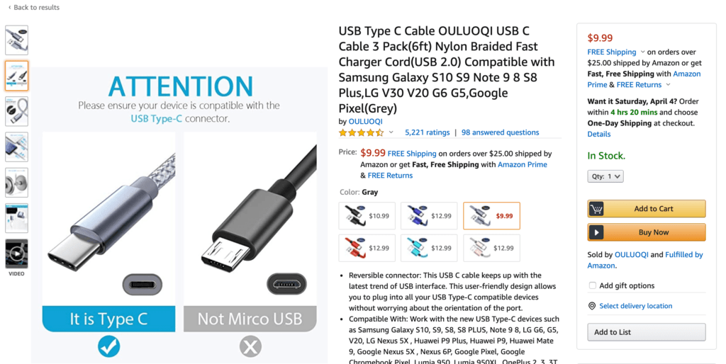
When it comes to product pages, CTAs are particularly important because they guide customers towards making a purchase. You’ll often see CTAs in the form of buttons, such as “Buy Now” or “Add to Cart”:

If you want to optimize your CTAs and get more clicks, consider these tips:
- Use compelling, action-oriented text, such as “Try The Free Demo” or “Buy From Merchant Now”
- Experiment with different color choices for your buttons to choose one that matches your brand but still stands out.
- Use large and legible text. It should be big enough to read and capture users’ attention right away.
- Create a sense of urgency with phrases like “Sign up today and get 30% off!”
- Place your buttons “above the fold” for maximum visibility
These little buttons pack a big punch because they give customers a clear and easy way to make a purchase. When a customer is browsing your site and they’re interested in a product, a well-placed CTA can be the final push they need to make a purchase.
3. Feature Excellent Photographs
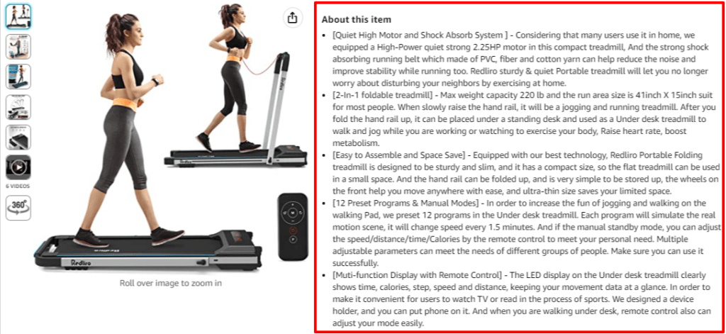
Having high-quality product images is essential when it comes to accurately showcasing items you’re promoting. Customers should be able to see all the details up close, like stitching, textures, and colors:

Photos are also important because they’re often the first thing people pay attention to when a page loads. Customers want to see what they’re getting and feel confident that the product matches their expectations.
Get in touch with the merchant to ask for high-quality images for your website. If the merchant doesn’t have great images on their own website, it can be just as easy to whip out your smartphone and take your own.
Here are a few amateur photography tips to keep in mind when taking pictures with your phone:
- Use natural light. Avoid using your phone’s flash and instead take advantage of natural light sources. Set up your product near a window or take it outside for the best lighting.
- Keep it steady. Use a tripod or stabilize your phone on a flat surface to avoid shaky images. This is especially important if you’re taking close-up shots of small details.
- Experiment with angles. Try taking photos from different angles to find the one that best showcases your product. You might want to take a few shots from above, at eye level, and even from below.
- Edit your photos. After taking your photos, you can use a photo editing app to adjust the brightness, contrast, and color balance to make your product really pop. Just be careful not to over-edit and make the product look unnatural.
By prioritizing great product photography, you can help ensure that your online store stands out from the competition and leaves a lasting impression on customers.
4. Enable Geolocation on Your Affiliate Links
Enabling geolocation on your affiliate links can greatly improve your chances of earning commissions from visitors all around the world.
Without geolocation, visitors from different parts of the world may be directed to the same affiliate program, which may not be relevant to their location.
For example, a visitor from the United States who clicks on your link may be directed to an affiliate program based in Europe, which may not have the same products, prices, or language support as the US-based program. This can lead to a poor user experience, confusion, and ultimately, a lost sale.
Lucky for you, the ThirstyAffiliates pro plan includes a geolocation module that, when enabled, allows you to add a url for each of the countries you want to service:

ThirstyAffiliates will then identify the customer’s location from their IP address and send them to the appropriate store!
5. Ensure Your Pages Load Quickly
According to Google’s mobile page speed study, a site’s bounce rate increases every second it takes for a page to load. The same principle also applies to desktop versions of websites. Additionally, 47% of online shoppers expect webpages to load in two seconds or less.
Optimizing the performance of your product pages is therefore key to maximizing conversions and keeping your customers satisfied. There are a number of steps you can take to improve your site’s loading times, including:
- Compressing your image files
- Minifying your site’s code
- Implementing browser caching
- Employing a Content Delivery Network (CDN)
- Removing unused WordPress plugins and themes
Platforms such as Google PageSpeed Insights and Pingdom Tools can test your current loading times to provide a baseline to work from.
Conclusion
Creating engaging product pages for your brand is not an intuitive process for most website owners. There are many aspects to consider and experiment with, which can make the process feel overwhelming.
In this post, we covered 5 ways you can create quality product pages to help your affiliate site succeed:
- Use informative and clear descriptions on each page.
- Include compelling CTAs to boost conversions.
- Feature excellent photographs to showcase your products.
- Enable geolocation to get commissions from international sales.
- Ensure that your pages load quickly to reduce bounce rates and increase sales.
Do you have any questions about product pages and how they can drive more sales? Let us know in the comments section below!
If you liked this post, be sure to follow us on Twitter, Instagram, Facebook, Pinterest, and LinkedIn! And don’t forget to subscribe to our newsletter!

Crisp photos are a must for engaging product pages. Clear descriptions and separate header tags with bold text help to break the page into sections, and make it easier for readers to absorb all the information on the page.
Captivating images play a pivotal role in creating compelling product pages. To make your pages stand out, it is essential to ensure that your product photos are crisp and visually appealing. Additionally, incorporating clear and concise descriptions, along with strategically placed header tags highlighted in bold, can effectively divide the content into easily digestible sections. By implementing these techniques, you enhance the overall user experience and enable readers to absorb all the valuable information seamlessly.
One of the best articles to date is this one. My favorite. I appreciate you publishing this. I’ll continue to return for more.
Creating engaging product pages is crucial for any affiliate site. It’s not just about showcasing products; it’s about captivating your audience and compelling them to take action. The tips shared in this blog post offer valuable insights on how to optimize your product pages for maximum engagement. Implementing these strategies can make a significant difference in driving conversions and increasing affiliate sales.
As an affiliate marketer, the primary objective is to maximize online sales. However, crafting captivating product pages that truly engage your audience can often prove to be a challenging endeavor. The multitude of factors to consider, ranging from design elements and aesthetics to the crucial user experience (UX), can make this process far more intricate than initially expected.
Creating engaging product pages for your affiliate site is crucial for driving conversions and maximizing your affiliate marketing efforts. The article provides five effective ways to achieve this goal, offering valuable advice for affiliate marketers. It would be helpful to hear more about the tools or plugins that can enhance the functionality and aesthetics of product pages. Are there any specific recommendations for optimizing page loading speed and user experience? Additionally, sharing examples of successful affiliate sites with engaging product pages would provide inspiration and practical insights for readers. Hearing about real-life experiences and additional strategies for creating compelling product pages would greatly benefit affiliate marketers.
These tips are great. I like to use the site crawler info from Ahrefs and Google to identify and fix any potential issues with my site to ensure it always loads quickly. I recommend others do the same!
Using site crawler information from tools like Ahrefs and Google is indeed a smart approach to identifying and addressing any possible issues that may affect the loading speed of your website. By utilizing these resources, you can gain valuable insights into areas where improvements can be made, such as optimizing code, compressing image files, or implementing caching mechanisms. It’s great to hear that you are proactive in ensuring your site loads quickly. I wholeheartedly agree with your recommendation for others to do the same. By prioritizing site performance, you can enhance the user experience, reduce bounce rates, and increase the likelihood of conversions. Keep up the good work!
This article has been really helpful because I’m a blogger that is just getting started and I am building an affiliate site but didn’t know how to stand out amongst all the competition. There are so many sites and ads out there and now I feel more confident about creating compelling landing pages that people will want to read.
Adding a products features and benefits sounds like a great idea and making sure that I include a clear call to action seems obvious but for me it wasn’t until I read your blog.
I will share this post on my social media so that anyone else who is feeling lost will be able to learn more about the right ways to set up an affiliate marketing blog!
Thanks
Mike…
Creating engaging product pages is crucial for affiliate sites. Compelling visuals, persuasive copywriting, social proof, and clear calls-to-action are key elements to captivate visitors and boost conversions. Great tips!
The blog had a conversational tone, making it feel like a friendly discussion rather than a formal article. It was enjoyable to read!
Learned something new. Would use it on my website. Let’s see whether it works.
Thank You
Creating engaging product pages for an affiliate site is crucial to capturing the attention and interest of your audience.
Thank you!
Nice article, it does not happen often to actually learn something nowadays with all that content out there
One of the best articles to date is this one. My favorite. I appreciate you publishing this I’ll continue to return for more.
The blog post provides a comprehensive overview of the key factors to consider when creating engaging product pages for an affiliate site. The five tips are all well-founded and actionable.
I especially like the tip about using informative and clear descriptions on each page. This is essential for providing potential customers with the information they need to make an informed purchase decision.
its vey Creating engaging product pages for an affiliate site