Contents

Running an affiliate website isn’t always easy. If you’re promoting more than one product, it can get even harder. A resource page can be a convenient way to display all your partnered products, but you might not know how to get started with one.
Fortunately, the process doesn’t have to be difficult. By looking at a few key tips, you can create a powerful resource on your site and start driving more conversions.
In this article, we’ll go over a few reasons why you might want to create a resource page for your affiliate website. Then, we’ll share some advice to help you get started. Let’s go!
Why You Might Want to Create a Resource Page
A resource page is a part of your site where you can feature the tools you use to run your website. This page typically acts as a list of relevant, personalized recommendations for your audience. As such, it can be a prime opportunity to promote your affiliate links.
This resource offers a few benefits. For one thing, it’s a simple way to centralize many different partnerships for your users. It can also help put a personal touch on whatever you’re selling.
Nevertheless, these resources don’t have to be attached to an affiliate link. You might choose to promote non-affiliated products as well. This can balance out the page and help you ensure that you’re providing as many helpful recommendations as possible.
How to Create a Resource Page for Your Affiliate Website (3 Tips)
Are you ready to create your resource page? Here are three important things to keep in mind.
1. Go Into Detail
If you simply display your affiliate links without much context, chances are you won’t see your sales soar. That’s why we recommend that you go into detail when listing your products. This shows that you understand the product while also providing necessary information to your users.
We recommend that you try to answer three key questions:
- What is the product?
- How do you use it for your own needs?
- Why should your users consider it?
You might also want to include some relevant examples. This can make your recommendation more convincing.
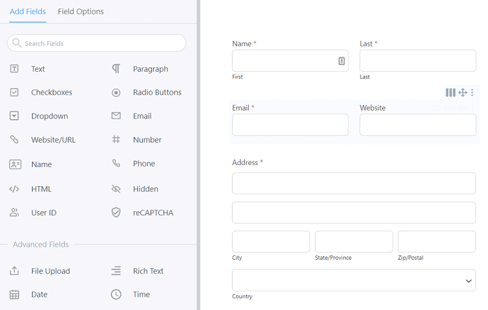
For example, let’s say you use Formidable Forms to create forms on your affiliate website. If you also want to promote the company’s link, you might choose to feature a behind-the-scenes look at the role it plays on your website:

This can help reveal the practical benefits of the tool while also providing a preview of what users can expect from it. For maximum impact, consider pairing these images with ones of the final product so your audience can see its full capabilities.
However, we also urge you to keep your recommendations as concise as possible. You wouldn’t want to overwhelm your users with too much information.
2. Choose Your Format Carefully
Visitors tend to get intimidated by huge walls of text, meaning they probably won’t read what you have to say. As such, it’s important to format your resource page with care.
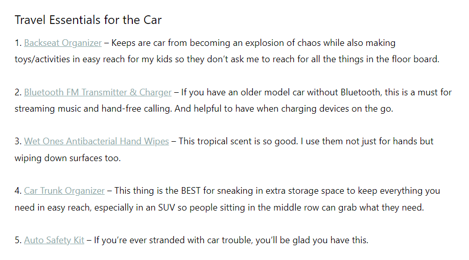
If you only have a few links, this might not be as much of an issue. You primarily have to worry about even spacing. For example, the Bless’er House blog opts for a simple yet effective list:

However, formatting becomes more important as the number of affiliate links grows – and at times, more complicated. Fortunately, a few simple steps can help.
We highly recommend that you use images. It’s an easy way to break up your content into digestible parts. As a bonus, it will also provide a more visual preview.
You might also want to consider adding categories to your page. One of the downsides of a resource page is, it can easily become cluttered. Applying a simple category system can improve navigation and get users to the most relevant products more quickly.
Try to keep your links in mind, too. The randomized URLs provided by partners tend to look long and confusing. This could scare your users into thinking it’s untrustworthy. We suggest that you use a link shortener like Pretty Links to create neat and branded URLs.
3. Involve Your Audience
Resource pages typically consist of your personal recommendations. However, that doesn’t mean that your voice is the only one that you should feature. You may also want to consider ways to get your audience involved.
Incorporating your users’ thoughts is a simple yet effective strategy. That’s because your visitors will likely be able to relate to the stories of fellow users. It can also increase the perceived amount of support for whatever product you’re promoting.
Even quick reviews can work wonders. This form of social proof is so effective that we use it on our own site:

You don’t have to include recommendations for every product. We suggest that you pick one or two to start with. Make sure they’re ones that already have high reviews from your users. That way, you’ll be tapping into a level of interest that’s already there.
You might also want to combine this approach with the categories strategy we mentioned earlier. Consider creating one that’s specifically for “fan-favorite” products. It’s an easy way to feature your engaged community. It can also be a jumping-off point for users who don’t know what they’re looking for yet.
Finally, keep in mind that not every item has to come with an affiliate link attached to it. In fact, overwhelming your users with these URLs could make you look pushy. You may want to prioritize products that meet their needs, even if you’re not partnered with the company.
Conclusion
One of the best ways to promote affiliate products is by showing users how you use them. Creating a resource page can be an effective way of doing this, but getting it right isn’t always easy. Fortunately, a few pieces of advice can go a long way.
In this article, we showed you three tips for building a resource page for your affiliate site:
- Make sure to include detailed information about your tools.
- Create a clean and skimmable page.
- Incorporate your audience’s recommendations.
Do you have any questions about creating a resource page on your site? Let us know in the comments section!
If you liked this post, be sure to follow us on Twitter, Instagram, Facebook, Pinterest, and LinkedIn! And don’t forget to subscribe in the box below.

Would like to be an affiliate business man
Thanks for your help.
Great and Informative Article. looking forward to more.
Informative Article.
Great article, Thanks a lot for sharing.
Was researching the resources page and how to create one. This is very helpful. Thank you so much.
You don’t tell us how exactly this page can be created. I will going to add it as a normal page into the website?
In the world of Internet Customer Service, it’s important to remember your competitor is only one mouse click away.
Well written info, highly recommend that
Creating a resource page for your affiliate website is an excellent strategy to provide value to your audience, enhance user experience, and potentially increase affiliate conversions. A well-curated resource page can serve as a go-to destination for your visitors looking for valuable information and recommendations. Here’s a step-by-step guide on how to create a compelling resource page for your affiliate website:
Step 1: Define Your Audience and Goals
Identify Your Target Audience:
Understand your website visitors’ interests, needs, and preferences.
Define Goals for the Resource Page:
Clearly outline the objectives you want to achieve with the resource page, whether it’s providing helpful information, boosting affiliate sales, or both.
Step 2: Choose a Strategic Location
Optimal Placement:
Select a prominent and easily accessible location for your resource page, such as the main navigation menu or a dedicated section on your homepage.
Step 3: Content Curation
Select Relevant Categories:
Organize your resources into categories based on the topics or products you’re affiliated with.
Curate High-Quality Resources:
Include links to reputable and high-quality products, services, tools, or content that align with your niche.
Provide Descriptions:
Write concise and informative descriptions for each resource to explain its value and how it benefits your audience.